Month: October 2009

Can Its Description Make it Art?

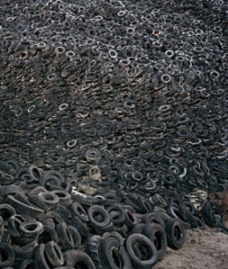
oilOilEdward Burtynsky

Looking at a photograph of thousands of tires doesn’t really compel me to think hard and stare long at the composition, the light, the perspective. Until I read the title. “OIL”. Now it grabs me emotionally because it makes a political/social/environmental statement. Interesting how context (sometimes positioned by words) can change our appreciation of something.

Distortion, Glorious Distortion

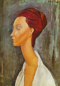
modiglianiElongation, distorted hands, feet, necks. This is the single-most characteristic that I look for and admire in works. If it’s stretched, pressed, enlarged, or diminished beyond its normal state, I love it. And for this, I cannot get enough of Modigliani.

Those necks! Those eyes!

Less obvious is the use of elongation in Caravaggio’s The Supper at Emmaus. The elongated right hand of the disciple sitting at the table draws the viewer in to the painting.

caravaggiosupper_at_emmaus_national_gallery_london

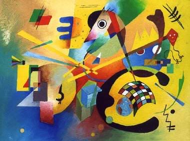
And distortion can portray a sense of the grotesque, the humor, the abstraction of a figure or scene. I especially like the abstraction in Eastern European art, particularly Russian art, like Kandinsky, which inspired some of those in the surrealist movement.

kadinsky

To The French, Art Trumps Economy

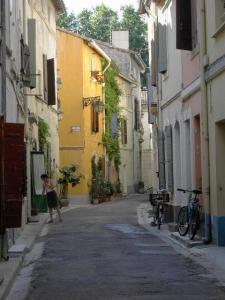
arles

On my way out of the French embassy in DC a few weeks ago (I took part in an annual embassy tour), I picked up “France magazine No. 90″ from a gorgeous ($$$) breakfront in the marbled lobby. Just one of many marketing tools in Washington, one would think that a magazine such as this would focus on a country’s economic entrees. But no this one. The French embassy’s magazine focuses on “the best of culture, travel, and art de vivre.”

But now that I think about this, how better to push your economy by playing the hand that you are dealt… and France has been blessed with great art and great beauty over the centuries (rather than technical or commercial innovation). This is, after all, how everyone views France, so I agree, French embassy, show it off to the nth degree!

The magazine’s feature articles include:

  • Arles Goes Gehry
  • The Art of Christian Boltanski
  • Artisanal Beer

Fabulous. The graphics-infused magazine is a tromp through high-end stores in Paris, all aflurry with radical new designs in furniture. And exposes on small towns in France feature, guess what? The art. This tiny town has X-number of theaters, X-number of galleries, X-number of artists-in-residence. And the article on artisanal beers — who would think art would come into play with beer? — is complete with an Art Nouveau poster of a drinking hall by Alphonse Mucha, created in 1897. The article on the tiny town of Arles makes the case that it could become the next Bilbao as Frank Gehry is “sketching its future.”

French embassy, I’m sold! I’m on the first plane to Arles. Or pretty much to ANY tiny town in France, for that matter, as I would surely be surrounded by art.

“Mona Lisa” aka “La Giconda” aka “A Certain Florentine Lady”

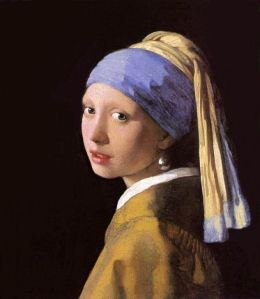
earring

Slate has a fabulous article out “Mona Linda? Nah. How About Mona Lisa?” that discusses the origins of an artwork’s name. Who decides what to call an old painting?

The article reveals that until the 17th century, artists rarely chose names for their works, choosing instead general, non-specific names like “Profile of a Young Woman”.

It’s a wonder how these pieces were referenced and recognized with 100% veracity, especially when there were so many drawings or sketches made prior to the actual oil, that were also sold across the market?

What was most fascinating to me, however, is that Dutchman Johannes Vermeer, one of the most celebrated artists of all time (and who has recently had a resurgence with a few of his works traveling in the US, as well as the bestseller by Tracy Chevalier a few years ago “The Girl With the Pearl Earring”) also blazed another trail by being one of the first artists to bestow a conceptual title on one of his works:

Vermeer painted a self-portrait called The Art of Painting. He never sold the piece, keeping it in his home until his death in 1675. Historians believe Vermeer himself named the work because his widow identified it by the moniker very shortly after his death.

Also how many names can the “Mona Lisa”  have? Perhaps squabbling art historians all wanted to lay a claim to history with a new name.

16th-century art historian Giorgio Vasari, considered by many to be the first art historian, is  the man who identified the sitter for Leonardo’s most famous painting as Florentine aristocrat Lisa del Giocondo. This hypothesis gave rise to the popular name Mona Lisa in England and the United States. Many French and Italian critics, however, refer to the work as La Joconde or La Gioconda, respectively, referring to the sitter’s family name. (Interestingly, these phrases translate loosely into English as “the one who smiles.”) Prior to Vasari, the painting had been called A Certain Florentine Lady or A Courtesan in a Gauze Veil.

The Tradition of Conceptual Art

stone-age

The evolution of how art is produced (the conception and construction) usually tells of a stark difference between the paleolithic age and today. Art in the paleolithic age was perhaps relegated to those with free time on their hands, which was hard to come by, given the hard lifestyle of hunting and gathering. And given this time crunch, there wasn’t much time to play with ideas, to think about new or inventive ways to conceive and produce art. This is perhaps the polar opposite of today’s art. I would agree with this New York Times article that “What is important today is not technical skill, but skill in playing inventively with ideas.”

For example, Damien Hirst’s “Medicine Cabinet” installations are a twist on an artistic representation of a common, everyday thing. He didn’t sit down with barbed wire and a soldering mask and get to work. His “people” do that. It’s his mind and inventiveness that are the commodities.

Now, it’s true that the majority of artists don’t have minions to go about crafting some visionary’s dreams. But, in some cases, so goes the current state of conceptual art. 

So how long has the idea of conceptual art been around? Can we find it in the paleolithic age? Maybe in a very primitive way the seeds of conceptual art were starting even back then.

Researchers looking at  stone age tools have declared that some  — hand axes, for instance — were not used solely for the act of hunting and gathering; that they were prized as art objects to be admired. For example, hand axes had a high rate of manufacture (above what they’d need to butcher animals), often have no signs of wear, some were too big for use, and some were decorated with “expensive” materials and exquisite workmanship.

Someone had to conceive the idea that it was important for these fancy hand axes to be made and that they would then be admired by perhaps a big group of people, so despite their limited resources, they still chose to create art for themselves. Much of it was probably done for ritualistic purposes, but even so, the concept of reinventing something useful for aesthetics was in play even in the stone age, even for  “primitive” man.
Slow Art = Touchy Feely Art

Slide1

A recent article by Edward Sozanski, art critic for the Philadelphia Inquirer, caught my attention because it firmly dissects new categories of art from old. Digital art from portraiture, etc. In “The Satisfactions of ‘Slow’ Material Art” he first talks about the “old” type of art, or what he calls “material art”:

Material art can be two- or three-dimensional, although … its allure is strongest with media that are worked with the hands or with tools.

And then he correlates “material art” with “slow art”:

[Material arts] are splendid examples of what I like to call “slow art,” not only because they take time to make, but also because they require time to absorb and understand. The longer one looks – and this process can involve years, as it has for me – the more one is able to appreciate both the formal ingenuity and seductiveness of the compositions and the perceptual dualities they generate.

He then refers to ceramicist William Daley’s opening talk at his exhibition of ceramic vessels where he asked people to do something with his pieces that could not be done with newer media.

He invited people to touch and caress his pieces, normally strictly verboten in museums and galleries. What better way to connect with the material than to stroke its surface?

However, I do have a slight rub with this. He is espousing more traditional art forms, however, he breaks traditional norms of the museum by allowing people to touch his pieces which is “normally strictly verboten”. Hmm. We need to find peace between the warring new and old paradigms.

The Embedded Message in Architecture: Or, What Can Architecture Teach Us About Writing?

Slide1

On the group-hosted writing blog Murderati, Toni McGee Causey has written a MUST READ article “Positive and Negative Spaces” that absolutely knocked my socks off (and, judging by the comments at the end of the blog, much of the blogging world’s too). She refers to a book 101 Things I Learned in Architecture School  recommended by literary agent Janet Reid, and says that 

“the entire book… has as much to do with writing and living as it does architecture. And I hadn’t expected to have a startling revelation about my own life.” 

In her critique, Toni posits that we dwell in positive spaces (think about your house where you dwell and do all of your cooking, living, spend most of your time) and and move through negative spaces (a street intersection that facilitates the quick itinerant movement of people).

And from there, she rocks out the article, comparing and contrasting life in negative and positive space. And wow, it’s an incredibly interesting ride. Here’s one (ok, three) snippets that I’ll leave you with:

When I thought about [positive and negative space] in relation to writing, I had a twofold appreciation for the term. First off, just the physical aspect of the page—the words and paragraphs create positive space and the white space around it is the negative space. If you pick up any manuscript and it’s filled with long, dense paragraph after paragraph, it feels cluttered and heavy, weighted and overwrought, even before you’ve read a single word. A reader brings with her the expectation of balance, and you need white space to achieve that balance. Too much white space, though, feels bereft of weight, of value, of deeper meaning, and so it’s the writer’s job not only to craft the words, but to pay attention to the space those words take up on the page.

Positive spaces are almost always preferred by people for lingering and social interaction. Negative spaces tend to promote movement rather than dwelling in place.

I’ve had people hand me novels in the past for critique and they spend a couple of chapters (or more) “building the world” – telling the reading about the political and economic machinations which have brought this world into being, into the state we find it in at this moment in time. It’s a huge mistake to do this. For one thing, the story hasn’t started yet until the characters are moving through that world and experience conflict within it. For another, the writer isn’t trusting the reader to extrapolate the positive and negative spaces from a select few examples.

Theory and Technique in the Arts and the Crossover to Writing

Degrees of Freedom book reading

Degrees of Freedom book reading

Last night I held a book reading of Degrees of Freedom at Visible Voice books in Tremont, Ohio. It was lots of fun, conversation ran the gamut (what’s the difference between creativity and craft? does one trump the other in terms of importance? how does applying  musical techniques to your writing improve it? can skills or techniques learned in different arts — music, performance art, architecture — transfer?)

Recently, on literary agent Rachel Gardner’s blog, Heather Goodman wrote an excellent post “Finding Your Voice” on how to utilize musical techniques to improve writing.

As a musician, understanding the idea of voice in writing came to me via music. Just as composers and performers have unique sounds, so do writers. Faulkner favored wordy sentences, intricate descriptions, and heady emotions while Hemingway preferred a stark style. You have a favorite author for a reason. The way she unfolds a story and character resonates with you. This goes beyond conquering the rules of the craft–using active verbs, avoiding words like just and immediately, and showing instead of telling. Voice is one of the hardest things to develop as a writer, but it’s also the most important aspect. It makes the story uniquely yours.

She also provides several techniques to strengthen her musical composition that she transferred to her writing.

1. Mimic other authors. In composition classes, we wrote Baroque counterpoint and fugue, Classical sonata forms, and Debussy-like floating chords. The intention wasn’t to be Bach, Beethoven, or Brahms but to play with different forms and styles in order to understand them. Then we gave them our own twist.

2. Write stream of consciousness. In one of my composition classes, I wrote what seemed to me too sentimental. But the instructor recognized something with its lyrical, idyllic, and playful qualities that reflected my style.

These techniques can, of course, be applied to performance art, visual arts, etc. AND they are fun!

Art, Rio de Janeiro Style

Hélio Oiticica. Metaesquema No. 237. 1958

Metaesquema No. 237

Hélio Oiticica (Brazilian, 1937-1980) MoMA

When we learned that Rio d Janeiro had edged out Chicago and others for the title of host of the 2016 summer olympics, I flew straight to the computer (who am I kidding, I read the press release on the computer; I’m always ON the computer) and looked up the museums central to Brazil’s cultural climate.

What I found was a world that I’ve only marginally explored. I’m guilty of looking internally to US-focused art and artists, and to Western Europe as well. But South America and Latin America often get the short end of the stick. From Mexico, we have Diego Rivera and his muse and probably better half, Frieda, and others. But what other master artists are lurking behind their shadows, just to the south?

Brazil’s contemporary arts scene is alive, and it’s traveling all over the globe. I researched one Brazilian artist just to get a taste. Hélio Oiticica is showing atMuseum of Modern Art, LACMA, Houston’s Museum of Fine Arts, and overseas at Museu d’Art Contemporani de Barcelona, and in Zurich at the Daros Exhibitions. He was an essential part of the geometric abstraction period between 1930s and the 1970s in Buenos Aires, São Paulo, and Rio de Janeiro. His Metaesquemas series (shown above) is composed of squares and rectangles, showing influences of Piet Mondrian.

An exhibition at the Museu d’Art Contemporani de Barcelona provided a great overview of his life and outlook:

Born in Rio de Janeiro in 1937, Oiticica began to study art in his home city where he formed links with Lygia Clark and Lygia Pape’s Neo-concrete Group and participated in the Frente Group. From the outset, his work was geared towards condemning the living conditions and the political situation affecting Brazil… Oiticica posited that for artistic production to be ethical, it must be activated by its audience. In the late sixties and early seventies, Oiticica began creating architectural environments he called Penetrables and tent/cape/banner works he named Parangolés. Both the Penetrables and Parangolés were made to be inhabited, examined, worn, even hidden in; they are environmental structures, experienced by the participant.

After receiving a Guggenheim Fellowship, Oiticica moved to New York where he lived from 1970 to 1978. He began to make films influenced by the cinema of Jack Smith and Andy Warhol and the popular culture of the United States. He undertook a series of projects under the umbrella title Quasi-Cinemas. Some of these were Super 8 films, but most of them were “projection-performances.” In 1973, as part of the Quasi-Cinemas, he made the series Block Experiments in Cosmococa, Program in Progress. The Cosmococas are composed of slide projections, environments, soundtracks, and instructions.

Hélio Oiticica died in Rio de Janeiro in 1980 aged 43.

http://www.artcyclopedia.com/nationalities/Brazilian.html

Van Gogh’s Letters: He Didn’t Always ‘Burst Forth’ With Emotion

Ahh. Starry Night will always be my favorite. And maybe the Yellow House too — both the painting and the book. If you haven’t read “The Yellow House” which is about Van Gogh’s and Gauguin’s nine months in Arles together, it’s an easy read and a gem!

But the “breaking” news is that Amsterdam’s Van Gogh Museum is out with a compendium of Van Gogh’s letters. Chock full of illuminating thoughts on his life, the letters are surely to entice Hollywood into a movie, right?

Shedding new light on the Arles painter:

In Lust for Life, Van Gogh is presented as writing his letters as a highly-strung personality, slapping his words onto paper in great emotion. This did happen, but only occasionally, usually when it involved a family row. In contrast, reading through the 2,180 pages of the new edition of the letters shows that the artist was highly focused. True, he was an obsessive in one sense, in his dedication to developing as an artist, but the letters are usually carefully (and sometimes beautifully) written, normally with a clear purpose in mind. 

The Letters also reminds us that Van Gogh approached his painting in a similar fashion. He did not throw his paint on the canvas in a burst of emotion, but considered carefully the effects he was striving to achieve. This comes through clearly in the stream of comments that he made to his brother Theo and his artist friends, in describing the pictures he was completing.