idea

Inspired by Design Shows

The Cleveland Institute of Art is holding its annual CIA Spring Show, and it is nothing short of inspiring. When I walked through the exhibits, glossy marketing posters shone under the white curvilinear walls in Case Western University’s Peter B. Lewis Building (designed by Frank Gehry, by the way). I snuck a peak at Industrial Design, Interior Design, Communication Design and small portions of Ceramics, Enameling, Glass, Jewelry + Metals.

In the Design Environment, there were re-styled foodmarts based on adult vs. teen preferences, an American Greetings kiosk which merged their card selection and a candy outlet, ergonomic chairs (that often looked really uncomfortable), re-thought ways to re-brand hip-hop music from illicit lyrics to clean lyrics, restyled totes/water bottles/coffee mugs, and wallpaper inspired by Viktor Schreckengost, the industrial engineer who was an instructor at the Cleveland Institute of Art. (Another aside: Schreckengost was a powerhouse. His foundation’s webpage says this about his work: “Every adult in America has ridden in, ridden on, drunk out of, stored their things in, eaten off of, been costumed in, mowed their lawn with, played on, lit the night with, viewed in a museum, cooled their room with, read about, printed with, sat on, placed a call with, enjoyed in a theater, collected, been awarded with, seen at a zoo, put their flowers in, hung on their wall, served punch from, delivered milk in, read something printed on, seen at the World’s Fair, detected enemy combatants with, written about, had an arm or leg replaced with, graduated from, protected by, or seen at the White House something created by Viktor Schreckengost”.)

All in all, it was an inspiring show. Now I’m really ready to figure out how to satisfy that 20-years-long design annoyance: how to create a nailpolish bottle and a brush long enough to scoop up that last bit at the bottom?

Wayne Thibaud at the National Gallery of Art

My cakes!

Well, not really — not in a full-on Thibaud exhibition, at least. But something perhaps much more fun! On the National Gallery of Art’s classroom education page, you can decorate your own Thibaud cakes! Here’s some I “decorated.”

http://www.nga.gov/education/classroom/interactive/cake.htm

Art on a Bus, Art in a Museum: How Do YOU See It?

Promotion for the Cleveland Museum of Art's new East Wing

Friday morning, while navigating a stream of rush-hour traffic, a bus whizzed by. Usually rattled by anything five times the size of my car, I grumbled and looked up. But what I saw on that big ‘ole bus made my day! Why? Splashed on the side was a huge banner (above) advertising the Cleveland Museum of Art’s new East Wing (fabulous, by the way — all glass, glossy floors, and a bow to the 19th century original building). Its message was magnificent!

“How Do YOU See It?” read the caption on the banner in milk-colored script. The museum was inviting the public to share their views of what the art means to them. Usually you walk through, read the placards, and take away the curator’s view. Or if you take a tour of the museum, you come away believing the docent’s view. Or maybe when you stare up at the painting you only try to figure out what the artist herself was saying. Here it’s all about the individual viewer and their impressions. What does the artwork make the viewer feel, see, think about?

[Shameless plug, but this is exactly my theme in my book Degrees of Freedom.]

When you enter the galleries, you are invited to share your take on the CMA’s works of art by submitting comments using interpretive cards available on-site at the museum. The Cleveland Museum of Art cards, which are an assortment of works by Modigliani, Avedon, others, read: 


Everyone interprets art differently. Consider this an invitation to use this card as a canvas upon which to describe, draw, paint, decoupage, distress, haiku, or whatever will best communicate how you see this piece of art.


Now, if I can just get my hands on those cards (which will be used by the museum for promotional purposes) – what a feast!

Data Visualization: Is It Art?

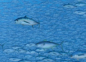
Depicts 20,500 tuna, the average number of tuna fished from the world's oceans every fifteen minutes.

Depicts 20,500 tuna, the average number of tuna fished from the world's oceans every fifteen minutes.

Zoomed in even closer

Zoomed in even closer

Does art spur emotion or does emotion spur art? (Well both, duh.) But data visualization seems to throw its weight into this debate.

Here’s a fascinating article from the NYT on data visualization. I’m such a visual learner that data visualization is right up my alley. I can’t fathom a string of numbers, but I can get the essence of 1,000 sharks’ teeth or 2 million fish. (I was talking yesterday with a colleague about that other type of “string” — string theory. You can imagine that my eyes were glazing over.) I wrote something about “volume” on my blog recently in the “Guiness Book of World Records” post… someone had collected thousands of graffiti stickers and then posted them in a room and called it art. And there was the photo of hundreds of clergy at St. Peters. These perhaps lean more toward the wow! factor than being art for art’s sake. Maybe.

So what is data visualization? From the NYT:

Data visualization…is an interpretation, a different way to look at and think about data that often exposes complex patterns or correlations.

Data visualization is a way to make sense of the ever-increasing stream of information with which we’re bombarded and provides a creative antidote to the “analysis paralysis” that can result from the burden of processing such a large volume of information. “It’s not about clarifying data…It’s about contextualizing it.”

My favorite (and the most easy to interpret) example of this is Chris Jordan’s portraits of global mass culture in the “Running the Numbers” photography series which he uses “as a bridge between alienating information and its emotional impact.” The photos above, for example, illustrate a specific quantity of something: the number of tuna fished from the world’s oceans every fifteen minutes.

But is this art? In Chris’ work, which largely shows the effect of human consumption/impact I guess you could say that he used emotion (poor tuna!) to spur art:

large amounts of fact data > emotion > “emotional” data > becomes art

Which turns on its head the below philosophy that puts art at the beginning of the chain — that seeing a piece of art spurs emotion:

art > perception of art > perception of beauty > spiritual and physical love (emotion)

This second concept flow is the central theme of Degrees of Freedom.

Art Latches On To… The Guiness Book of World Records?

Is art latching onto the concept of “go big or go home!” “Whoever accumulates the most, wins!” “I have more than anyone else in the world!” Is more and bigger, better? I ask because:

Starting in the early nineties, Michael Anderson, a Bronx-born artist, began to amass what has come to be regarded—unofficially, and mostly by Anderson himself—as the world’s largest collection of graffiti stickers…For years, they sat quietly in notebooks in the artist’s Upper West Side apartment. Last April, the owners of the new Ace Hotel at 29th and Broadway came calling with a mural commission. Completed last month, it’s most likely the only museum devoted to this extremely ephemeral form. 

I love this. Anderson calls himself a curator, largely because the graffiti were all done by graffiti artists, whose work he cobbled together, printed on silk paper, and assembled in a collage.

But the striking part of it is how many, which leads you to “wow!”

It’s about scale and the idea that by simply viewing  something that we can feel really small or on top of the world or invincible. It’s not about each and every individual sticker; it’s the menagerie that tricks the eye and the mind into going somewhere else.

I talked about this “bigger is better” concept here as “critical mass” https://lorigordon.wordpress.com/2009/04/11/critical-mass/ 

anything portrayed in critical mass will be poignant. 1,000 butterflies, 1 million grains of sand, 40 carats of rubies…

Mona Lisa: Will ‘Smile’ for Coffee

Mona Lisa made with cups of coffee

  • 3,604 cups of coffee
  • 564 pints of milk (for color variation)
  • 20ft by13ft (nearly ten times the size of Leonardo da Vinci’s original masterpiece)
  • Took a team of eight people three hours to complete
  • Created for The Rocks Aroma Festival (coffee lovers’ event) in Sydney, Australia

A variation of the traditional “sketch”? I think so.

Dead Butterflies and the King of Cycling

damien-hirst-lance-armstrong-stages-trek-1

Lance, je t’aime, but what were you thinking?

The bike is gorgeous. Just gorgeous. Damien Hirst created a brand-spankin’ new one for Lance to ride on the last stage of this year’s Tour de France that wrapped itself 8 loops along the Champs Elysees. It was covered in real butterfly wings. Ahh. Is there anything more beautiful?

But let’s come to a screeching halt here: does Hirst create beautiful art? I’m not entirely sure this is his thing. Projects such as the shark in formaldehyde, etc. etc. have all been, well, grotesque. Is creating the sense of beauty an entirely new endeavor for Hirst?

So back on the bike…  Couldn’t they have used fake butterfly wings? Hirst said no, that he was going after the irridescence and shimmer that only real wings could exude. But those poor butterflies…

Which begs the question, does art need to be stark raving real to be beautiful? Don’t synthetics have a place?

Also, is  Hirst saying that Lance is a dead butterfly?

Museum of Knowledge

Mental Maps

Mental Maps

I walked into an exhibit in Budapest, and to my horror, I thought I had walked into my office back in the States. Plastered across the barren-white walls were posterboard-sized mental maps (“mind maps” I call them, for sorting/aggregating/classifying topics and ideas). But the more closely I looked, I realized that at the Dorottya Gallery on ultra-chic Vorosmarty ter, that a new kind of musem was born: The Knowledge Museum.

Here, Bucharest-based artist Lia Perjovschi “proposed an imaginary museum… which comprises drawings, objects, charts, photos, and color prints, [and] is an objectification of the mass of information the artist has acquired through reading, travelling, and creative work. The ‘mental map’ thus created offers a view into those processes of selection that define the artist’s attitude towards the world, her methods of associating things, of building her own understanding of the world.”

First of all, we all need to create a mental map to declutter and organize our messy lives. Everyone’s map would be vastly different, and quite foreign to the next person, but strikingly clear and concise to its owner. All of this is very exciting. Sharing mental maps would be like peeking into your lunch bag in the cafeteria.

“Whatchu got?”

“Reese’s Cups. Whatchu got?”

“A fruit cup.”

[Mortified stare by Mr. Reese’s Cup]

Perjovschi, a collector, created the idea in part because of her interest in “shifting the focus from the spectacle to the learning process.” A disagregated collection, or one where all the parts don’t flow together in some organized way can create 1) bad feng shui, and 2) the anxiety that each individual piece should knock your socks off. But how about if that one particular piece is there not on its own accord, but because it was placed to round out the rest of the collection? To round out your mental map/world view?

Someone could write a thesis on this topic. Or a brief. But I… won’t. THAT’s really too much like work.

A Twist on ‘Public’ Art

The Fourth Plinth on Trafalgar Square

The Fourth Plinth on Trafalgar Square

This weekend, sculptor Antony Gormley is hosting several guest “artists” on the fourth plinth in Trafalgar Square. I’ve written about this before. Winners were chosen by a computer algorithm from a set of 615 contenders.

The 100-day event, called One & Other, is sculptor Antony Gormley‘s winning submission in the long-running scheme that allows artists to fill the plinth for a limited period. One & Other will, Gormley suggests, “be like opening up a Pandora’s box of ideas”.

Among the chosen “living sculptures” revealed this weekend are:

  • David Rosenberg, a 41-year-old architect, will mount his pink, folding bike and use pedal power to light up a specially designed suit.
  • Retired teacher Gwynneth Pedler, who at 83 is the oldest “plinther” selected so far, plans to go up in her wheelchair and signal messages with semaphore flags.
  • Oliver Parsons-Baker, 26, an aquatic scientist from Birmingham, plans to highlight the global shortage of clean water by dressing up in a “poo costume” and then he will then change into a fish costume to illustrate the dangers of over-fishing.

It’s the ultimate public art piece: it promotes social engagement, features the public itself, and is live performance art all rolled into one. It’s “Survivor” slash “Big Brother” slash insert-favorite-voyeur-show-here — but with an artistic twist. In fact, several UK tv stations plan to air parts of the ballyhoo.

Where would this take place in the U.S.? Thinking of places similar to Trafalgar…. In Times Square? Dupont Circle? Fenuil Hall?

Male Art, Go Gather Dust


Pompidou Center, Paris

Pompidou Center, Paris

Having put works by male artists in storage, the Pompidou Centre in Paris is preparing to open a new exhibition, elles@centrepompidou, filling its permanent collection galleries with the tale of art since the twentieth century as seen exclusively through the eyes of female artists, The Los Angeles Times reports. The exhibiton’s organiser conceeds that taking this approach to the display of Europe’s largest collection of Modern and Contemporary Art is a risk: “Excluding men and showing only women is a revolutionary gesture of affirmative action. But the museum is avant-garde. It’s part of the Centre Pompidou culture to do things differently. And we like a lot of drama. This is going to be dramatic in a big way.”

Wow, I don’t even know what to think of this. It’s a pretty groundbreaking concept: Putting works by male artists in storage.

In storage.

Feminist shows are set up all the time. That part of it is nothing new. It’s the storage thing that gets me (although I can’t think of another  solution). To put something into storage is so deameaning. It screams “object, you are so useless to me right now that you don’t deserve even a daily glance.”

Maybe I’m just thrown by that powerful intro (in storage!), but this is saying to me “move over men! We women are not only exhibiting by ourselves, but we may not bring back your stuff at all.” It’s like the women can’t wait for the dust to move in, settle down, and grow thick. Real thick.

Sorry, I’m just really hung up on words. When journalists write, they pick words very, very carefully.

I’ve said it before, but wow. Critics can really move a concept and a reader’s impression. There’s no indication of how long the exhibit will show, but I’m sure the exhibitionists are in no rush to reinstitute normalcy.

Where Art and Words Collide

Born Magazine creation

Born Magazine creation

Not to be missed. Simply NOT to be missed! Born Magazine (online mag) brings together graphic/visual artists with poets and prose writers to make magic.

http://www.bornmagazine.org/projects/chimney/

http://www.bornmagazine.org/projects/conjoined_twins/

http://www.bornmagazine.org/projects/house_fire/

Even the View Waxes Poetic

duomo.jpg image by emillyorr

Hold on to your flying buttresses: the Milan Cathedral, the 600-year-old Italian Gothic structure, will hold its first concerts on the building’s roof…[for] the first time in more than six centuries

How different would the experience be sitting on a rooftop as opposed to a concert hall? I can imagine very different. The rarity of the experience would make it more acute. The timeline would come into play. I’d be consumed thinking about the concert that happened six centuries ago. Time would revert back. You’d start to envision what different instruments would appear before you. The different sounds. The different horizon line. The music would achieve its ultimate goal: to move you to a different place.

The Dawn of the Metrocurator

The New Curator  has come up with a new concept (at least to me) of curating in big cities where there’s a lot to curate: Metrocurator. New Curator defines it like this:

Metrocurators is the term I used to describe a new generation of curator that’s lightweight, deals in very little bureaucracy, has a DIY attitude because of very limited funds and basically is running all over a city pushing small outbreaks of museums into public spaces.

It’s fabulous concept, and the article goes on to explain that the metrocurators might get their “stuff” from venture culturalists (another brilliant concept, but that’s not new). But why is this metrocurator concept new? Is it because we hoard our art? Is it because no one has been stricken with the idea that they could ship out their art on loan? Or maybe they think that their collection is paltry and nobody would want to look at it (I’m in this category). Or that they have a random grouping of art and it doesn’t work collectively (but I think the point of metrocurating is that it’s pulled together from various places anyway, to culminate in an exhibition.) Or maybe people are just too busy to go to the trouble. Too busy to share.

I’m not sure where the museum would be housed (has the metrocurator snagged a downtown loft with brilliant lighting?). I don’t think people who do have art to offer would want the random public traipsing through their home.

I think it’s a concept that needs molding & sculpting. But it’s a great one.

The Sticker (and its message?) Sticks

EnjoyBanking's political stickers

EnjoyBanking's political stickers

When does political art become bubbly and cutesy? I guess recently in NYC… The recent economic downturn has inspired a varied group of artists (economists, photographers, filmmakers, etc.) to create EnjoyBanking, a politically charged campaign that plasters bubbly stickers all over NYC. The signs read “Enjoy Credit Crunch,” “Enjoy Bailout Package,” “Enjoy Golden Parachutes,” etc. They pack a considerable punch, delivering a pretty serious message in light undertones. Where graffiti is mostly associated with gangs and reads language in gobbledygook undecipherable by the average passersby (granted, it has been embraced as a medium in art exhibits too), the EnjoyBanking project is clear in its message. Graffiti seems more randomly placed, whereas these stickers are deliberate and targeted. The project has also been methodically engineered and rolled out:

A few weeks after their first sticker attack appeared, the masterminds behind this economically-charged street art surfaced on Twitter and Flickr to post their thoughts and images for the world to see. After a few weeks of watching to see where this project would lead, I spotted one gate impressively plastered with the bubbly words near Houston (it was part of NYSAT).

Follow-Up to Crossover Artists

Another example of artist’s exploring words,  language, verbal artistry:

Jenny Holzer, Green Purple Cross, 2008

Jenny Holzer, Green Purple Cross, 2008

On view at the Whitney, March 12-May 31, 2009: Jenny Holzer’s pioneering approach to language as a carrier of content and her use of nontraditional media and public settings as vehicles for that content make her one of the most interesting and significant artists working today… Jenny Holzer’s work has paired the use of text and the centrality of installation to examine emotional and societal realities…

Crossover Artists

"Meditation Fruit" Rose Folsom

"Meditation Fruit" Rose Folsom

I’ve been intrigued by a trend to sync up writing and art expression:

In her show at Paula Cooper, Sophie Calle has a gazillion women respond — from the standpoint of their profession — to a breakup letter she received. A magician, singers, translators, a rifle shooter, etc. all react to the text in video or through the written word. the array of sturdy women and the solidarity is indeed empowering.

It’s interesting that for the longest time, writers have been calling it the “art of the written word,” where writers have used words to create images. Now artists are more and more using words to create images.

Here’s another example:

Rose Folsom is an amazing calligrapher who has migrated the art of writing toward the fine arts…One thing that impresses itself on th viewer is that the writing is not immediately decipherable…It demands a closer look. There is an attempt to communicate somthing… We are not merely the passive receivers of the words, but we are asked to participate in a conversation. (See above “Mediation Fruit”)

Inserting Yourself in Art

Is there a better way to capture the essence of art than to insert yourself in it? This is exactly what Antony Gormley is trying to do with an empty plinth in Trafalgar Square. But do you think it will resonate more to the exhibitionists balancing on top of the monument or to the gawkers walking by?

Antony Gormley's One & Other

Antony Gormley’s fourth plinth commission is built around volunteers from the public. Photograph: PR

The fourth plinth in Trafalgar Square, London, was built in 1841 to carry an equestrian statue of King William IV but the money ran out. Since then there has been much discussion – and no agreement – about what to put permanently on top of it. The latest idea, from artist Antony Gormley, is to let 2,400 people stand on it for one hour each, 24 hours a day, for 100 days. “This elevation of everyday life to the position formerly occupied by monumental art allows us to reflect on the diversity, vulnerability and particularity of the individual in contemporary society. It could be tragic but it could also be funny,” Gormley says.

The Art of Process

Conceiving a piece of work (a painting, a novel, a poem) can take 3 days or 3 years. Or it can happen spontaneously, as the brush hits the canvas. I’d think that more commonly artists chew on  the threads of a concept for awhile, as they brainstorm, twist, challenge, sharpen ideas that will eventually take form on paper, canvas, or in clay. This is all a part of the creative process. No less creative, however, are those whose art is conceived spontaneously, and even moreso, without the deliberate intent of the artist.

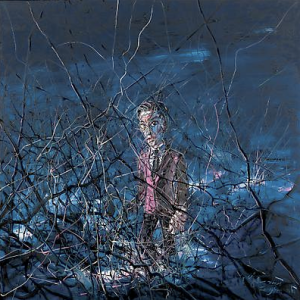
Zeng Fanzhi, "Untitled 08-12-19", 2008, Via Acquavella Galleries
 Zeng Fanzhi, “Untitled 08-12-19”, 2008, Via Acquavella Galleries

Consider Chinese contemporary artist Zeng Fanzhi‘s technique, as shown at Art Observed:

He holds two –sometimes even four- brushes at a time, allowing him to create and to destroy form simultaneously.  As a result, the paintings convey a sensation of spontaneity and sentiment.

Holding two or more brushes in hand, an artist can conceivably control only one brush; the others are simply stragglers making their own design. Looking at Fanzhi’s works, however, you can’t separate what was spontaneously created or what was conceptually premeditated, as the two techniques are seamlessly intertwined to create the “sensation of spontaneity and sentiment.” The viewer can’t distinguish between which brushstrokes were intently applied and which ones were stragglers.

In some ways,  I think this mimics daily life. With several brushes in one hand, we meticulously guide just one brush to paint our actions; the other brushes represent our scattered, non-focused, actions. Our friends (the viewers) often cannot tell what actions/comments are deliberate brushstrokes and which are not.

And so Fanzhi has captured the process of human nature: we paint our lives with many brushes.

Professional vs. Amateur…Hard to Tell the Difference

I’m clearly no design critic, but at the Cleveland Institute of Art’s Spring Show (Industrial Design, Illustration, Material Culture, Visual Arts and Technologies, Integrated Media and Foundation, etc.), it was hard to imagine that what I was seeing was student art and not the professional, polished work of major design companies. If not for the blurb on the flashy eye-candy posters “Sponsored by Hummer” or “Sponsored by Proctor & Gamble” I doubt anyone like me walking through could ever have figured out that these were actually created by 20-somethings who still party ’til 2 am most nights.

Is this the “state of things” now at design schools? That students are all as polished as professionals? (Or is CIA just “that good?”) If so, then that’s great. It must be hard for design/ad/engineering companies to choose from such a talented field. (Also makes it that much harder for students graduating to get a job.) But on the flip side, if student work IS as good as that you see splashed all over glossy magazines, then does that mean that graphic design/ad companies aren’t stepping it up to the next level? Once these students get jobs, do they peter out? I have no idea, just throwing that out there. I guess I just haven’t seen a case or a media where the student/professional similarity was so striking.

Struck By the Artist’s Words (As Much As the Work?)

Wow. It took me awhile to figure out what I was going to say about the recent John Sargent III show that I saw with a friend of mine at the Tregoning Gallery. In case you were wondering, 1) Yes, Sargent is grandson to THE John Singer Sargent and 2) Yes, the Sargent show coincided with the Pekoc show that I wrote about yesterday.

Sargent’s talent is clear, but I was struck moreso about what he had to say verbally (not only orally, in person, but in text in the xeroxed-program guide/handout, of all things). I kept chiding myself that maybe I couldn’t get all that he had written in his “world view” two-pager by staring at his paintings. It’s obvious that anytime you are able to talk with the artist through his exhibit, you get a much richer view. But how about if his written or spoken thoughts/views/ideas are so compelling that they move you… maybe even moreso than his canvas? This is really odd to say, coming from me, a very visual person (I draw Venn diagrams ALL the time, about anything and everything… at first work-related, it has infiltrated my daily to-do lists).

Perhaps all of this means that he’s a really great writer, and that there’s poetry in his words as well as his art. I once went through life thinking that some artists need/use art as the vehicle to better convey their thoughts. But Sargent is just as gifted writing it all out on two pieces of plain white paper stapled together. Well, at least enough to move me (the visually challenged one? now I’m starting to get a complex!). 

Here are some of Sargent’s pearls of wisdom:

  • “When I began painting, it was enough to create a likeness. Today that is the least of my concerns. A painting must now stand on its own and speak for itself.”
  • “A finished painting… has a visual voice.”
  • “These recent paintings are emerging conversations. They are not conclusions. Ask me today, and I will say what I have to say. In a month, in a year, it will all change.” (This is something I struggle with. I always set my goal and figure out the dots to connect to get there.)